Github desktop has been a helpful companion to my development work for some time now. It’s lightweight, easy to use and integrates nicely with github.com
However there is one neat feature that github desktop v1 had that the newer v2 doesn’t.
The simplified tree view:
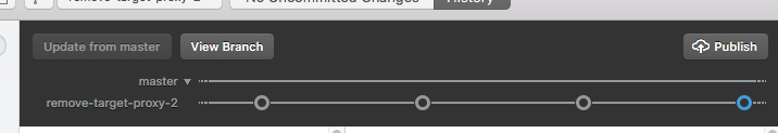
I think it’s a really neat piece of user interface because it displays so much information in a small area that would probably otherwise be empty. Yet it’s much simpler than most git tree views, which I find tend to find display too many details. Somehow the information density seems just right, neither too much nor too little. Perhaps it is the Goldilocks of git tree views?
One other interesting observation is that the component was written in javascript, with bits of svg and was particularly designed to work cross platform. Somewhere there is even an article written by the developers, although I can’t find it right now. If you want to understand how the thing works, the whole javascript source is actually shipped inside the v1 app. It’s really very clever.
I appreciate that maybe the app developers are going in other directions, but hopefully they’ll add something like this back into the app. (There is already a bug requesting it!)